Rachel Keohane + The Story Behind
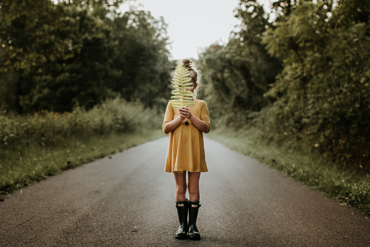
The saying “less is more” resonated with us when we spotted this image from Rachel on our IG feed. When you look at it, there’s no insane amount of light bursting from the back, the colors palette consists of 3 main colors and you don’t see the subject’s face. BUT what makes this image stand out to us and why we wanted to feature it is because we love the artistic quality it possess. It has a bit of The Son of Man painting by René Magritte feel to it. What little light it does have frames her backside perfectly. And the colors don’t compete with each other which allows to draw the viewer in. So if you’re curious how this image came to be, Rachel graciously share the information below:
IG Handle:.
@rachel.keohane
Where was this photo taken?
This was taken on my road in Cosby, Tennessee. (Right outside of Gatlinburg)
How did the location add or hinder to your image?
I was going for a certain mood and look for this series and I knew this location would help with the look I was wanting.
DSLR, iphone, instant or film?
DSLR – Canon 7D Mark II with Sigma Art 35mm lens.
What were your camera settings for this image?
ISO 100, f1.8, 1/400 sec.
Can you tell us “The Story Behind” this shot?
I have been in love with images with ferns and leaves in them. Fall just started and I knew the ferns along my road would be a beautiful shade of green and there were hints of yellow starting to come out in the leaves. I have been wanting to shift my images to a more artsy and moody vibe recently so I knew I wanted to capture something a bit different than I normally do. I love the symmetry of ferns and I realized my road gave a very symmetrical look as well. I had her stand in the middle of the road (we are 1 of 4 houses on this road so there are never any cars) and hold the fern in front of her face. I loved the vibe the faceless capture gave so it worked perfectly.
What speaks to you about this image? What specifically made you press the shutter?
The symmetry of the image really speaks to me. I’m not big on centering my subjects, so I was thrilled to get a shot I liked where my subject is directly centered.
What was your composition technique with this shot?
I wanted my subject to be in the center of the image. I was wanting a symmetrical look and the best way to achieve that was to have my daughter centered in the road.
Did you have any lighting challenges/How did you light the image?
No lighting challenges for this shot. I waited for golden hour to shoot this image. Golden hour is my favorite time to shoot, although it is a difficult time to shoot here in the mountains. It’s such a short window where I live because the sun sets fast behind the mountains, leaving only a short time when the light is perfect.
Did you use any special techniques – freelensing, prism, etc?
No, not at this time.
Was this photo happenstance or did you visualize it prior? If so, how did you envision the image and set up for it?
I originally intended for this session to be shot in a field off of my road. When I saw the symmetry of my road I knew I wanted to grab this particular image there instead of the open field.
Did you use a preset to edit this image, your own selective edits or a combination of both?
I used Tribe Archipelago LXCN 01 for this image. I almost always use this preset as a base for my images and then I do some heavy tweaking afterwards. The biggest adjustments I had to make on this picture after applying the preset was saturation, clarity and contrast.
