Lily Hatten + The Story Behind
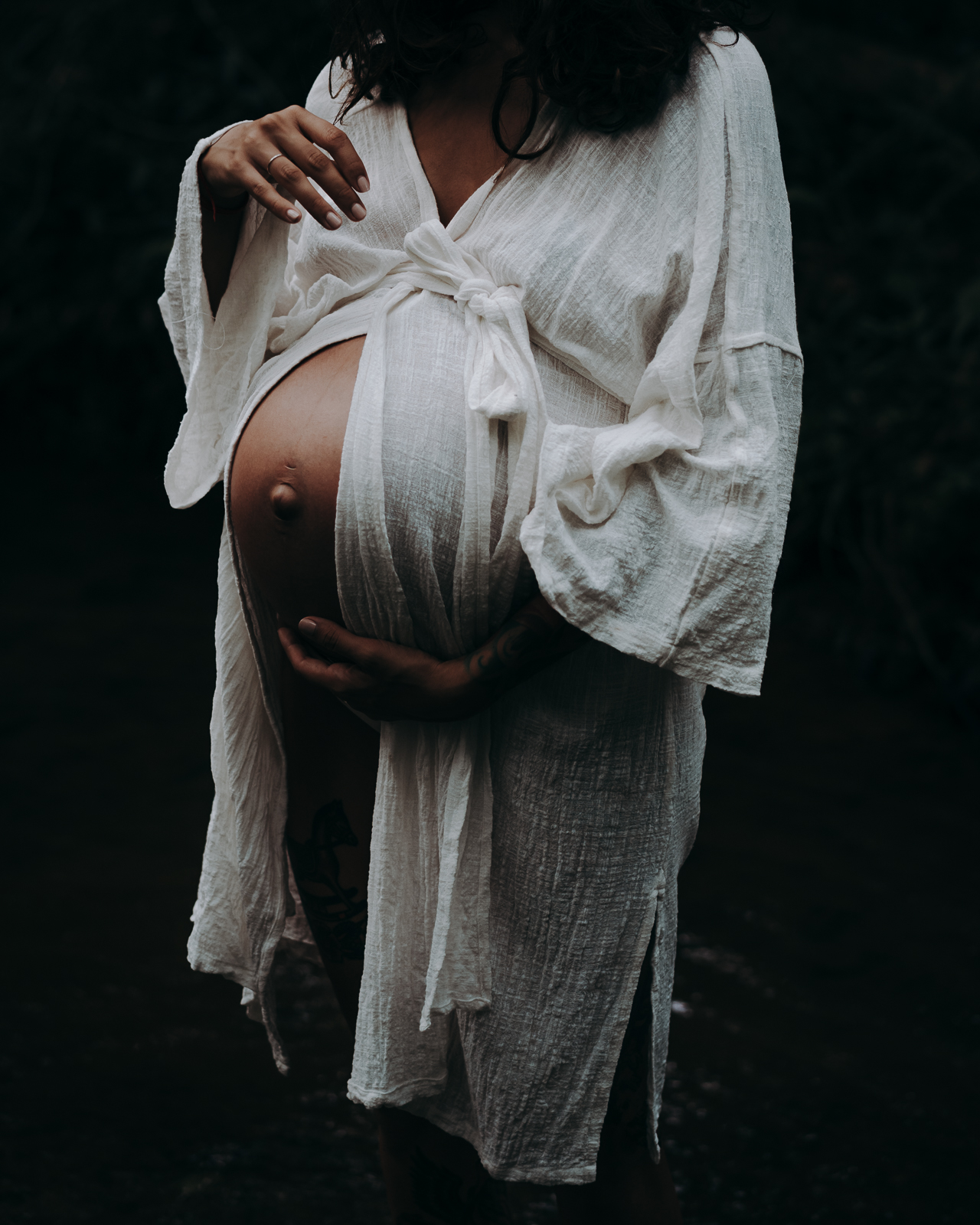
Less is more. Sometimes a competing background and a rainbow of colors can take away from images. That’s why we were drawn to Lily’s photo the second we spotted it in our IG hashtag feed. On one hand, the simplicity of it is beautiful but on the other hand, there is so much eyecandy starting with the gorgeous lighting, the textures of the robe and the editing. We definitely wanted to know more about it so we are delighted to feature her in this installment of The Story Behind:
IG Handle:.
@artemis.rising.photography
What inspires you?
I’m particularly inspired by motherhood. There’s so much to explore and unpack. But beyond motherhood, I guess I’m just searching for the things that make us human, the way we suffer for each other, the joy we bring to each other, the way our life stories are written on our bodies. And of course the stories that other people (too many to list) tell so beautifully through their chosen mediums.
Where was this photo taken?
It was taken down in the little creek behind my street.
How did the location add or hinder to your image?
The trees that surround this little creek form a natural cathedral so that the light that filters through starts off harsh and then falls off quickly, creating a sort of chiarascuro effect and the light dances on the water. I seek out lighting like this because I love the drama it adds to an image but it is challenging to work with as it’s not very forgiving and I have to be very deliberate about how I use it, although I also delight I’m happy accidents and where they take you. It’s also very green, which I don’t love and that proved to be a challenge in post-processing.
DSLR, iphone, instant or film?
Sony A7III full-frame mirrorless camera with the Sony FE 55mm f/1.8 lens.
What were your camera settings for this image?
ISO 400, f/2.5, 1/800 sec.
Can you tell us “The Story Behind” this shot?
Business had been pretty slow and I was feeling quite frustrated. I had all of this creative energy and not enough opportunities to direct it so I put out a model call for a woman who was happy to pose semi-nude, and mentioned that I’d love to work with a pregnant or breastfeeding woman (most of my followers are this demographic anyway) and this gorgeous mama responded. We played down at the creek with her two gorgeous kids (she’s going to have three under five, what a woman!) and we took some photos. I also needed to photograph this kimono so she rocked it for part of the shoot.
What speaks to you about this image? What specifically made you press the shutter?
I loved the way the light was illuminating her form and almost disappearing as it fell towards her feet. I love catching hands during the in between moments, when they’re moving from one thing to another there’s this sense of grace.
What was your composition technique with this shot?
My original composition was actually a lot wider, including her face and looking back at the photo I obviously used the rule of thirds. I was partly constrained by the slightly treacherous topography but the reason I cropped it this way is because I felt like her form was so exquisite in this frame that it demanded to be cropped.
Did you have any lighting challenges/How did you light the image?
I rarely use artificial light, I love working with the harsh Australian sun. I sought out this lighting, but it did prove challenging in photos where this mama is looking down at her belly because the shadows are so deep on her face, and if it wasn’t for the mosquitoes I definitely would have arranged the shoot to take place later in the afternoon so the sun came from an easier direction but I’m pleased with how it went over all.
Was this photo happenstance or did you visualize it prior? If so, how did you envision the image and set up for it?
Like many of my images, it was a little of both. I went into this shoot with the intention of focusing very much on her pregnant form and using the lighting to accentuate the beauty of her body. But she knows what she s doing, she’s modeled a fair bit so I was keen to direct her into the light and let her work her magic.
Did you use a preset to edit this image, your own selective edits or a combination of both?
I used a heavily modified version of LOOKSLIKEFILM C-01 from Meridian Presets in Lightroom. I also added a graduated filter on each side and deepened the blacks and the shadows in the graduated filters to really bring the eye to her belly and the kimono.
Do you have any addition information you would like to share with our readers?
One thing that I love to do with a photo is to take it to extremes to see the story that it might be trying to tell me. So I’ll underexposed the hell out of it in Lightroom for example, so that I can just see it in terms of shapes and light and shadow. Then I’ll slide it back to where I want it with a renewed understanding of the photo. Or a simple crop can take a photo in a completely different direction. I used to be afraid to change things too much, but there can be so much more to a photo if you just dig a little deeper.
Continue to be inspired by Lily’s work at the following:
SITE | FACEBOOK | PINTEREST

Barbara Hatten
Beautiful work Lily